距离上一篇文章「 MotionLayout:打开动画新世界大门(partI)」已经过去了很久,由于个人原因,MotionLayout 系列文章姗姗来迟。在之前的文章中,我们领略到了 MotionLayout 的魅力,了解到它继承自 ConstraintLayout,并具有它“约束布局”的特性。同时,关于如何创建和使用 MotionScene 及其内部的 KeyFrameSet 也都做了一些简单介绍。那么,本文来带大家进一步探索 KeyFrameSet 这个大家族中的“神秘宝藏”,并针对上文中留下的一些彩蛋进行讲解,来看看如何实现 MotionLayout 与其他控件的联动。
再探索 KeyFrameSet
在上文中我们说到 KeyFrameSet 能够让单调的动画独树一帜,可以根据我们的意愿来描述动画运动的轨迹。之前只是比较详细介绍了 KeyFrameSet 这个大家族中的 Keyposition,那么本文就来和大家窥探一下其他宝藏的秘密吧😄。
首先,我们来看一张熟悉的 MotionLayout 结构图:
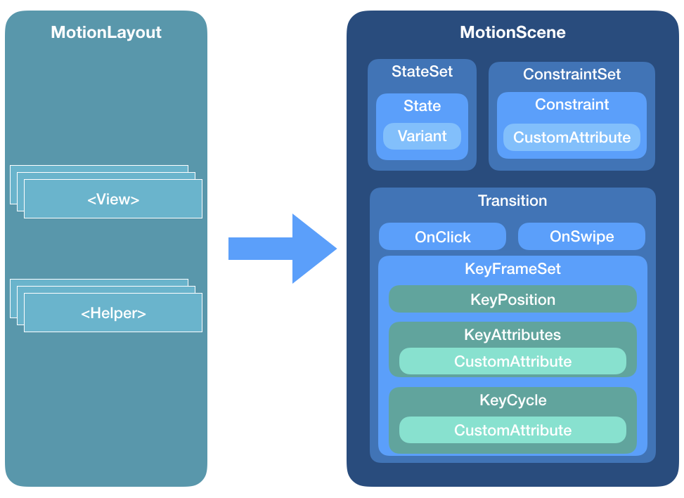
从上图我们可以看到,KeyFrameSet 中主要包含了 KeyPosition、KeyAttribute 以及 KeyCycle 三种类型的关键帧。其实除此以外,KeyFrameSet 还提供了 KeyTimeCycle 和 KeyTrigger,具体的用法和使用场景会在后续文章进行介绍。本文中,我们先来详细看一下 KeyAttribute 以及 KeyCycle。
KeyAttribute
我们知道,KeyPosition 描述的是目标 View 在某个位置的关键帧,进而改变动画的移动轨迹,至于 KeyAttribute,则是描述这个 View 在某个关键帧时所处的“状态”,即所谓的”高矮胖瘦“。前者侧重的是改变动画的轨迹,后者则是强调更改 View 自身的属性。
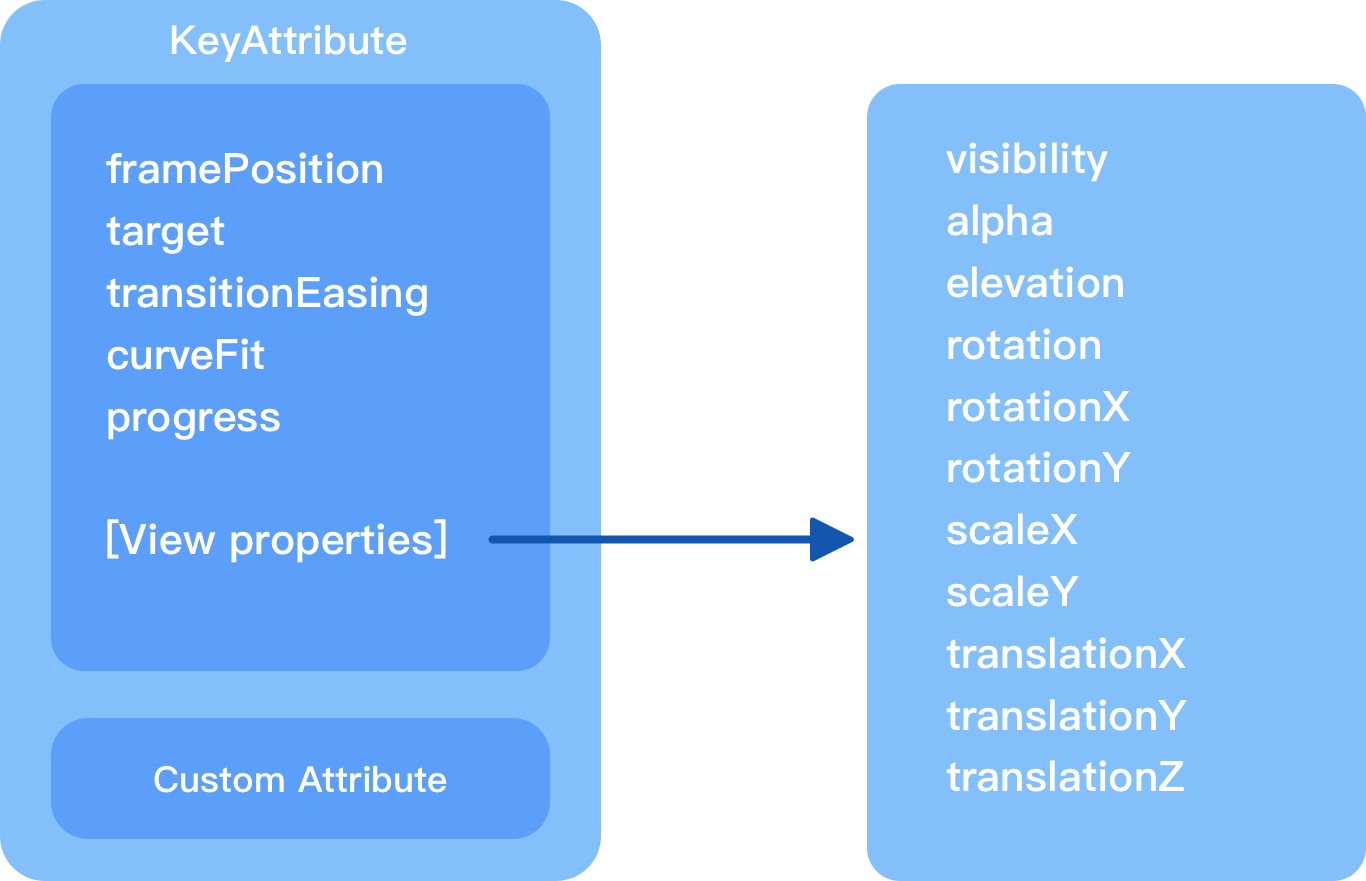
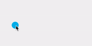
从上图的 KeyAttribute 结构图中我们可以看到,它支持各种属性,足够我们来描述一个 View 的状态了。假如我们希望实现如下效果:
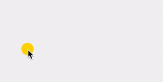
其实上面的动画实现很简单,只需要在特定位置添加一些“关键帧”就可以了:
1
2
3
4
5
6
7
8
9
10
11
12
13
14
15
16
17
18
19
20
21
22
23
24
25
26
27
28
29
30
31
32
33
34
35
36
37
38
39
40
41
42
43
44
45
46
47
48
49
50
51
52
53
54
55
56
57
58
59
60
61
62
63
64
65
66
67
68
69
70
71
72
73
74
75
76
<?xml version="1.0" encoding="utf-8"?>
<MotionScene xmlns:android="http://schemas.android.com/apk/res/android"
        xmlns:app="http://schemas.android.com/apk/res-auto">

    <Transition
            app:constraintSetStart="@+id/start"
            app:constraintSetEnd="@+id/end"
            app:duration="3200"
            app:motionInterpolator="bounce">
        <KeyFrameSet>
            <KeyAttribute
                    app:motionTarget="@+id/loading_ball"
                    app:framePosition="20"
                    android:scaleX="1.5"
                    android:scaleY="1.5"
                    android:alpha="0.7"/>
            <KeyAttribute
                    app:motionTarget="@+id/loading_ball"
                    app:framePosition="35"
                    android:scaleX="1"
                    android:scaleY="1"
                    android:alpha="1"/>
            <KeyAttribute
                    app:motionTarget="@+id/loading_ball"
                    app:framePosition="50"
                    android:scaleX="1.5"
                    android:scaleY="1.5"
                    android:alpha="0.7"/>
            <KeyAttribute
                    app:motionTarget="@+id/loading_ball"
                    app:framePosition="65"
                    android:scaleX="1"
                    android:scaleY="1"
                    android:alpha="1"/>
            <KeyAttribute
                    app:motionTarget="@+id/loading_ball"
                    app:framePosition="80"
                    android:scaleX="1.5"
                    android:scaleY="1.5"
                    android:alpha="0.7"/>
            <KeyAttribute
                    app:motionTarget="@+id/loading_ball"
                    app:framePosition="95"
                    android:scaleX="1"
                    android:scaleY="1"
                    android:alpha="1" />
        </KeyFrameSet>
        <OnClick app:targetId="@+id/loading_ball"
                app:clickAction="toggle"/>
    </Transition>
    <ConstraintSet android:id="@+id/start">
        <Constraint
                android:id="@id/loading_ball"
                android:layout_width="32dp"
                android:layout_height="32dp"
                app:layout_constraintBottom_toBottomOf="parent"
                app:layout_constraintEnd_toEndOf="parent"
                app:layout_constraintHorizontal_bias="0.15"
                app:layout_constraintStart_toStartOf="parent"
                app:layout_constraintTop_toTopOf="parent"
                app:layout_constraintVertical_bias="0.5"/>
    </ConstraintSet>

    <ConstraintSet android:id="@+id/end">
        <Constraint
                android:id="@+id/loading_ball"
                android:layout_width="32dp"
                android:layout_height="32dp"
                app:layout_constraintBottom_toBottomOf="parent"
                app:layout_constraintEnd_toEndOf="parent"
                app:layout_constraintHorizontal_bias="0.85"
                app:layout_constraintStart_toStartOf="parent"
                app:layout_constraintTop_toTopOf="parent"
                app:layout_constraintVertical_bias="0.5" />
    </ConstraintSet>
</MotionScene>
最终代码如上所示,是不是很 easy?这里我们在途经路线中添加一些特定的 keyAttribute ,并改变它们的属性状态,这里变化的属性只涉及到 scaleX、scaleY 和 alpha 。
考虑到 KeyAttribute 中提供的属性有限,所以,CustomAttribute 横空出世,它支持任意自定义的属性,常见的有 TextView 的 textColor、background 或者是 ImageView 的 src 、tint 等。当然还不止这些,我们平时自定义 View 中提供的自定义属性同样支持哦。就像 GitHub 上的一个 ShapeOfView 的开源项目,可以提供给我们自定义控件形状的功能,那么结合了 MotionLayout 中的 CustomAttribute,我们就可以达到下面这种平滑转换的效果:
举个简单的例子,上面的小球加载动画我们希望它能够在运动过程中颜色也随之变化,然而
1
2
3
4
5
6
7
8
9
10
11
12
13
14
15
16
17
18
19
20
21
22
23
24
25
26
27
28
29
30
31
32
33
34
35
......
<ConstraintSet android:id="@+id/start">
    <Constraint
            android:id="@id/loading_ball"
            android:layout_width="32dp"
            android:layout_height="32dp"
            app:layout_constraintBottom_toBottomOf="parent"
            app:layout_constraintEnd_toEndOf="parent"
            app:layout_constraintHorizontal_bias="0.15"
            app:layout_constraintStart_toStartOf="parent"
            app:layout_constraintTop_toTopOf="parent"
            app:layout_constraintVertical_bias="0.5">
        <CustomAttribute
            app:attributeName="colorFilter"
                app:customColorValue="@android:color/holo_blue_light"/>
    </Constraint>

</ConstraintSet>

<ConstraintSet android:id="@+id/end">
    <Constraint
            android:id="@+id/loading_ball"
            android:layout_width="32dp"
            android:layout_height="32dp"
            app:layout_constraintBottom_toBottomOf="parent"
            app:layout_constraintEnd_toEndOf="parent"
            app:layout_constraintHorizontal_bias="0.85"
            app:layout_constraintStart_toStartOf="parent"
            app:layout_constraintTop_toTopOf="parent"
            app:layout_constraintVertical_bias="0.5">
        <CustomAttribute
                app:attributeName="colorFilter"
                app:customColorValue="@color/colorAccent"/>
    </Constraint>
</ConstraintSet>
我们设置了 colorFilter 属性,作用相当于 tint,重新运行后,可以看到如下效果:
需要我们注意的是,这里的自定义属性的 attributeName 对应的值并不一定是在 xml 布局文件中控件对应的属性名称,而是在对应控件中拥有 setter 设置的属性名称。怎么理解呢?其实归根结底 CustomAttribute 内部还是利用的反射,从下面的部分源码中就能够察觉到:
1
2
3
4
5
6
7
8
9
10
11
12
13
14
15
16
17
18
19
20
21
22
23
24
25
26
27
28
29
30
31
32
33
34
35
36
37
38
39
40
41
42
43
44
45
46
47
48
49
50
51
52
53
54
55
56
57
58
59
60
61
62
63
64
65
66
67
68
69
70
71
72
73
74
75
76
77
78
79
80
public void applyCustomAttributes(ConstraintLayout constraintLayout) {
        int count = constraintLayout.getChildCount();

        for(int i = 0; i < count; ++i) {
            View view = constraintLayout.getChildAt(i);
            int id = view.getId();
            if (!this.mConstraints.containsKey(id)) {
                Log.v("ConstraintSet", "id unknown " + Debug.getName(view));
            } else {
                if (this.mForceId && id == -1) {
                    throw new RuntimeException("All children of ConstraintLayout must have ids to use ConstraintSet");
                }

                if (this.mConstraints.containsKey(id)) {
                    ConstraintSet.Constraint constraint = (ConstraintSet.Constraint)this.mConstraints.get(id);
                    ConstraintAttribute.setAttributes(view, constraint.mCustomConstraints);
                }
            }
        }

    }

......

public static void setAttributes(View view, HashMap<String, ConstraintAttribute> map) {
        Class<? extends View> viewClass = view.getClass();
        Iterator var3 = map.keySet().iterator();

        while(var3.hasNext()) {
            String name = (String)var3.next();
            ConstraintAttribute constraintAttribute = (ConstraintAttribute)map.get(name);
            String methodName = "set" + name;

            try {
                Method method;
                switch(constraintAttribute.mType) {
                case COLOR_TYPE:
                    method = viewClass.getMethod(methodName, Integer.TYPE);
                    method.invoke(view, constraintAttribute.mColorValue);
                    break;
                case COLOR_DRAWABLE_TYPE:
                    method = viewClass.getMethod(methodName, Drawable.class);
                    ColorDrawable drawable = new ColorDrawable();
                    drawable.setColor(constraintAttribute.mColorValue);
                    method.invoke(view, drawable);
                    break;
                case INT_TYPE:
                    method = viewClass.getMethod(methodName, Integer.TYPE);
                    method.invoke(view, constraintAttribute.mIntegerValue);
                    break;
                case FLOAT_TYPE:
                    method = viewClass.getMethod(methodName, Float.TYPE);
                    method.invoke(view, constraintAttribute.mFloatValue);
                    break;
                case STRING_TYPE:
                    method = viewClass.getMethod(methodName, CharSequence.class);
                    method.invoke(view, constraintAttribute.mStringValue);
                    break;
                case BOOLEAN_TYPE:
                    method = viewClass.getMethod(methodName, Boolean.TYPE);
                    method.invoke(view, constraintAttribute.mBooleanValue);
                    break;
                case DIMENSION_TYPE:
                    method = viewClass.getMethod(methodName, Float.TYPE);
                    method.invoke(view, constraintAttribute.mFloatValue);
                }
            } catch (NoSuchMethodException var9) {
                Log.e("TransitionLayout", var9.getMessage());
                Log.e("TransitionLayout", " Custom Attribute \"" + name + "\" not found on " + viewClass.getName());
                Log.e("TransitionLayout", viewClass.getName() + " must have a method " + methodName);
            } catch (IllegalAccessException var10) {
                Log.e("TransitionLayout", " Custom Attribute \"" + name + "\" not found on " + viewClass.getName());
                var10.printStackTrace();
            } catch (InvocationTargetException var11) {
                Log.e("TransitionLayout", " Custom Attribute \"" + name + "\" not found on " + viewClass.getName());
                var11.printStackTrace();
            }
        }

    }
首先在 MotionLayout 中,如果是自定义属性,那么会执行 ConstraintSet 类中的 applyCustomAttributes 方法,接着会调用 ConstraintAttribute 类中的 setAttributes 方法,就如上代码中所写的那样,它会根据属性名称组装成对应的 set 方法,然后通过反射调用。是不是有种恍然大悟的感觉?话说,这样的机制是不是好像哪里见到过?没错,正是属性动画。
KeyCycle
什么是 KeyCycle 呢?下面是来自 Gal Maoz 的总结:
A
KeyCycleis a highly-detailed, custom-made interpolator for a specific view, whereas the interpolator is influencing the entire scene, with a large focus on repetitive actions (hence the cycle in the name).
简单来说,KeyCycle 是针对特定视图的非常详细的定制化插值器。它比较适合我们常说的波形或周期运动场景,比如实现控件的抖动动画或者周期性的循环动画。
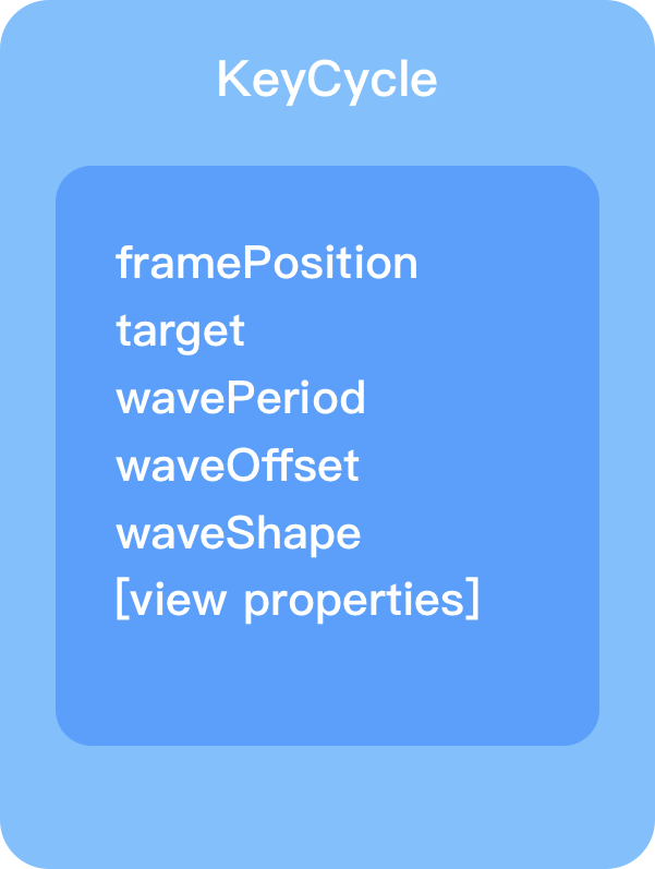
如上图所示,KeyCycle 主要由以上几个属性组成,前两个相信大家都比较熟悉了,这里不必多说,另外 view properties 正如之前的 KeyAttribute 结构图中所描述的那样,代表View的各种属性,如 rotation、translation、alpha 等等。 这里主要介绍另外三个比较重要且具有特色的属性:
wavePeriod:这个表示在当前场景位置下需要执行动画的波(周期)的数量。这样说可能不太容易理解,别急,我们待会举个例子说明。waveOffset:表示当前控件需要变化的属性的偏移量,即 view properties 所对应的初始值或者基准值。例如,如果我们在动画执行的某个位置设置了scaleX为 0.3,而设置了waveOffset值为 1,那么,动画执行到该位置,控件的实际宽度会变为1 + 0.3 = 1.3,也就是会扩大为 1.3 倍,而不是缩小为之前的 0.3 倍。waveShape:这个属性比较好理解,即波的形状,常见的值有:sin、cos、sawtooth 等,更多可参考官网API:https://developer.android.com/reference/androidx/constraintlayout/motion/widget/MotionLayout#keycycle
下面举个简单的例子帮助理解,以下面这个效果为例:
对应的 KeyFrameSet 代码如下所示:
1
2
3
4
5
6
7
8
9
10
11
12
13
14
15
16
17
18
19
20
21
22
23
<KeyFrameSet>
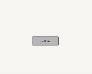
<KeyCycle
motion:framePosition="0"
motion:target="@+id/button"
motion:wavePeriod="0"
motion:waveOffset="1"
motion:waveShape="sin"
android:scaleX="0.3"/>
<KeyCycle
motion:framePosition="18"
motion:target="@+id/button"
motion:wavePeriod="0"
motion:waveOffset="1"
motion:waveShape="sin"
android:scaleX="0.3"/>
<KeyCycle
motion:framePosition="100"
motion:target="@+id/button"
motion:wavePeriod="3"
motion:waveOffset="1"
motion:waveShape="sin"
android:scaleX="0"/>
</KeyFrameSet>
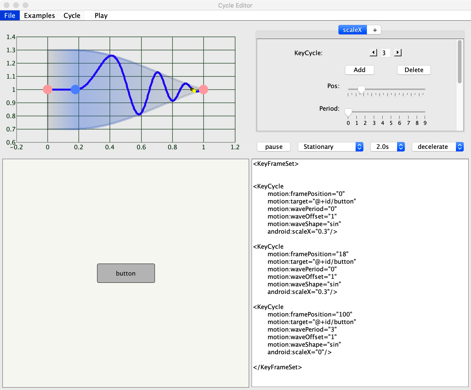
根据动画效果结合代码可以知道,我们这个放大的Q弹的效果只是改变了 scaleX 这个属性,并且让它“摇摆了”大概三个来回(周期),恰好 wavePeriod 属性值为 3。也许动画不太方便察觉,这样,我们借助于 Google 提供的专门用来查看 KeyCycle 波形变化的快捷工具来查看它波形变化过程:
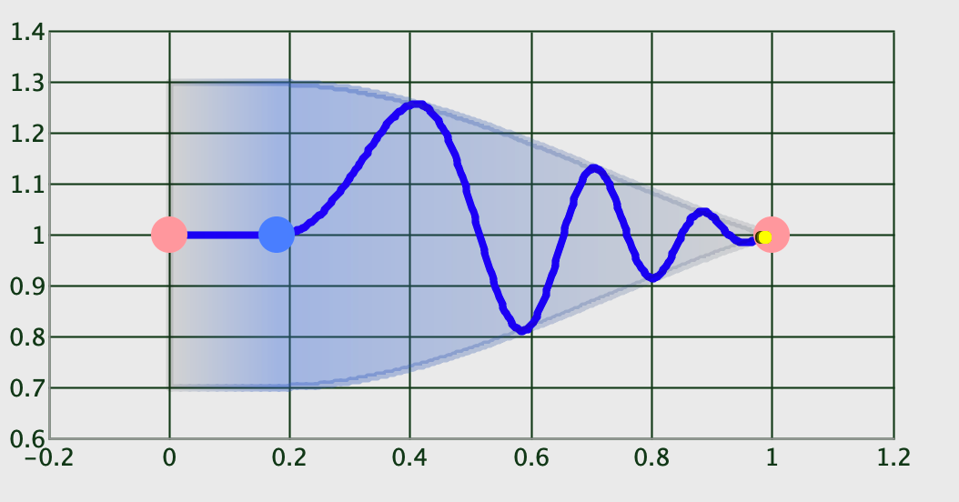
如此一来,我们就很直观地看到上图中描绘的波形变化过程了,的确是三个周期没有错,并且是以正弦 sin 来变化的。
关于这款工具的使用,大家可以前往:https://github.com/googlearchive/android-ConstraintLayoutExamples/releases/download/1.0/CycleEditor.jar 上下载,然后通过执行 java -jar [xx/CycleEditor.jar] 即可看到可视化界面,然后将 KeyFrameSet 部分的代码 copy 到编辑栏,然后点击 File -> parse xml 即可看到代码对应的波形走势。如下所示:
我们来看看下面这个效果:
这个Q弹的效果就是基于 KeyCycle 实现的,我们来看看它的场景实现:
1
2
3
4
5
6
7
8
9
10
11
12
13
14
15
16
17
18
19
20
21
22
23
24
25
26
27
28
29
30
31
32
33
34
35
36
37
38
39
40
41
42
43
44
45
46
47
48
49
50
51
52
53
54
55
56
57
58
59
60
61
62
63
64
65
66
67
68
69
70
<?xml version="1.0" encoding="utf-8"?>
<MotionScene xmlns:android="http://schemas.android.com/apk/res/android"
        xmlns:app="http://schemas.android.com/apk/res-auto">

    <Transition
        app:constraintSetStart="@+id/start"
        app:constraintSetEnd="@+id/end"
        app:motionInterpolator="easeInOut"
        app:duration="5200">
        <KeyFrameSet>
            <KeyCycle
                app:motionTarget="@+id/image"
                app:framePosition="10"
                android:rotationY="22"
                app:wavePeriod="2"
                app:waveShape="sin"
                app:waveOffset="1"/>
            <KeyCycle
                app:motionTarget="@+id/image"
                app:framePosition="30"
                android:rotationX="15"
                app:wavePeriod="1"
                app:waveShape="sin"
                app:waveOffset="0"/>
            <KeyCycle
                app:motionTarget="@+id/image"
                app:framePosition="65"
                android:rotationY="14"
                app:wavePeriod="1"
                app:waveShape="sin"
                app:waveOffset="0"/>
            <KeyCycle
                app:motionTarget="@+id/image"
                app:framePosition="92"
                android:rotationY="0"
                android:rotationX="2"
                app:wavePeriod="0"
                app:waveShape="sin"
                app:waveOffset="0"/>
        </KeyFrameSet>
        <OnClick app:targetId="@+id/image"
                app:clickAction="toggle"/>
    </Transition>
    <ConstraintSet android:id="@+id/start">
        <Constraint
            android:id="@+id/image"
            android:layout_width="120dp"
            android:layout_height="120dp"
            app:layout_constraintBottom_toBottomOf="parent"
            app:layout_constraintEnd_toEndOf="parent"
            app:layout_constraintHorizontal_bias="0.76"
            app:layout_constraintStart_toStartOf="parent"
            app:layout_constraintTop_toTopOf="parent"
            app:layout_constraintVertical_bias="0.45"/>

    </ConstraintSet>

    <ConstraintSet android:id="@+id/end">
        <Constraint
            android:id="@+id/image"
            android:layout_width="120dp"
            android:layout_height="120dp"
            app:layout_constraintBottom_toBottomOf="parent"
            app:layout_constraintEnd_toEndOf="parent"
            app:layout_constraintHorizontal_bias="0.76"
            app:layout_constraintStart_toStartOf="parent"
            app:layout_constraintTop_toTopOf="parent"
            app:layout_constraintVertical_bias="0.45"/>
    </ConstraintSet>
</MotionScene>
我们在动画路径上添加一些关键帧,并稍微改变控件的旋转角度,配合 keyCycle 就能达到上面的弹性动画,大家可以自己动手尝试体验一下。
MotionLayout 的联动性
很多时候,我们的控件并不只是单一的个体,而是需要与其他控件产生“交互上的关联”,常见地,Android 的Material design components 全家桶中提供了一套“优雅灵动”的组件,相信大家都体验过了,那么,我们的 MotionLayout 可以与它们碰撞出怎样的火花呢?
一切从“头”开始
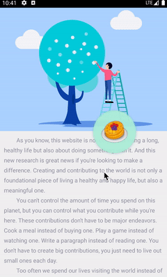
Material design 组件库中提供了一个 AppBarLayout 组件,我们经常使用它来配合 CoordinatorLayout 控件实现一些简单的交互动作,例如头部导航栏的伸缩效果,各位应该或多或少都用到过,这里不再介绍。下面我们就从 AppBarLayout 开始,看看如何实现与 MotionLayout 的联动。首先,我们先来看下面这个简单的效果:
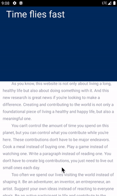
我们知道,通过 CoordinatorLayout 和 AppBarLayout 也可以实现类似的交互效果,但显然 MotionLayout 会更加灵活多变。其实上面的动画效果很简单,只是在 AppBarLayout 高度变化过程中改变背景色、标题的位置和大小即可,对应的 MotionScene 文件代码如下所示:
1
2
3
4
5
6
7
8
9
10
11
12
13
14
15
16
17
18
19
20
21
22
23
24
25
26
27
28
29
30
31
32
33
34
35
36
37
38
39
40
41
42
43
44
45
46
47
48
49
50
51
52
53
54
55
56
57
58
59
60
61
62
<?xml version="1.0" encoding="utf-8"?>
<MotionScene xmlns:android="http://schemas.android.com/apk/res/android"
    xmlns:app="http://schemas.android.com/apk/res-auto"
    xmlns:motion="http://schemas.android.com/tools">
    <ConstraintSet android:id="@+id/start">
        <Constraint
            android:id="@+id/background"
            android:layout_width="match_parent"
            android:layout_height="match_parent"
            motion:layout_constraintBottom_toBottomOf="parent">
            <CustomAttribute
                app:attributeName="backgroundColor"
                app:customColorValue="@color/blue_magic"/>
        </Constraint>
        <Constraint
            android:id="@+id/tipText"
            android:layout_width="wrap_content"
            android:layout_height="wrap_content"
            android:scaleY="1.6"
            android:scaleX="1.6"
            android:alpha="1.0"
            android:layout_marginStart="62dp"
            android:layout_marginTop="12dp"
            app:layout_constraintStart_toStartOf="parent"
            app:layout_constraintTop_toTopOf="parent"/>
    </ConstraintSet>

    <ConstraintSet android:id="@+id/end">

        <Constraint
            android:id="@id/background"
            android:layout_width="match_parent"
            android:layout_height="match_parent"
            motion:layout_constraintBottom_toBottomOf="parent">
            <CustomAttribute
                app:attributeName="backgroundColor"
                app:customColorValue="@color/bgColor_dark"/>
        </Constraint>
        <Constraint
            android:id="@id/tipText"
            android:layout_width="wrap_content"
            android:layout_height="wrap_content"
            android:layout_marginEnd="20dp"
            android:layout_marginBottom="12dp"
            app:layout_constraintBottom_toBottomOf="parent"
            app:layout_constraintEnd_toEndOf="parent"/>
    </ConstraintSet>

    <Transition
        app:constraintSetStart="@id/start"
        app:constraintSetEnd="@id/end"
        app:duration="4000">
        <KeyFrameSet>
            <KeyPosition
                app:framePosition="60"
                app:motionTarget="@id/tipText"
                app:keyPositionType="parentRelative"
                app:percentY="0.7"/>
        </KeyFrameSet>
    </Transition>

</MotionScene>
结合以上效果图,我们很容易理解上面的场景实现代码,那么,我们再来看下布局文件:
1
2
3
4
5
6
7
8
9
10
11
12
13
14
15
16
17
18
19
20
21
22
23
24
25
26
27
28
29
30
31
32
33
34
35
36
37
38
39
40
41
42
43
44
45
46
47
48
49
50
51
52
53
<?xml version="1.0" encoding="utf-8"?>
<androidx.coordinatorlayout.widget.CoordinatorLayout
    xmlns:android="http://schemas.android.com/apk/res/android"
    android:id="@+id/content"
    android:layout_width="match_parent"
    android:layout_height="match_parent"
    android:fitsSystemWindows="false"
    android:background="@android:color/white"
    xmlns:app="http://schemas.android.com/apk/res-auto">
    <com.google.android.material.appbar.AppBarLayout
        android:id="@+id/appBarLayout"
        android:layout_width="match_parent"
        android:layout_height="260dp"
        android:theme="@style/AppTheme.AppBarOverlay">
        <com.moos.constraint.widget.MotionToolBar
            android:id="@+id/motionLayout"
            android:layout_width="match_parent"
            android:layout_height="match_parent"
            app:motionDebug="NO_DEBUG"
            app:layoutDescription="@xml/motion_scene_simple_appbar"
            android:minHeight="52dp"
            app:layout_scrollFlags="scroll|enterAlways|snap|exitUntilCollapsed">
            <View
                android:id="@+id/background"
                android:layout_width="match_parent"
                android:layout_height="300dp"
                android:background="@color/blue_magic" />

            <TextView
                android:id="@+id/tipText"
                android:text="Time flies fast"
                android:layout_width="wrap_content"
                android:layout_height="wrap_content"
                android:textSize="20sp"
                android:textColor="@color/white"
                app:layout_constraintEnd_toEndOf="parent"
                app:layout_constraintTop_toTopOf="parent"/>
        </com.moos.constraint.widget.MotionToolBar>
    </com.google.android.material.appbar.AppBarLayout>
    <androidx.core.widget.NestedScrollView
        android:layout_width="match_parent"
        android:layout_height="match_parent"
        app:layout_behavior="com.google.android.material.appbar.AppBarLayout$ScrollingViewBehavior">
        <TextView
            android:layout_width="wrap_content"
            android:layout_height="wrap_content"
            android:textColor="@color/content_text_color"
            android:lineSpacingExtra="8dp"
            android:padding="12dp"
            android:text="@string/long_text_en"/>

    </androidx.core.widget.NestedScrollView>
</androidx.coordinatorlayout.widget.CoordinatorLayout>
观察上面布局文件,其实代码与传统 CoordinatorLayout & AppBarLayout 交互的代码大同小异,只不过我们在 AppBarLayout 内部添加了一个 MotionToolBar 控件,这其实是个 MotionLayout,只不过内部根据 AppBarLayout 伸缩的高度动态改变动画进度而已,我们来看下具体实现:
1
2
3
4
5
6
7
8
9
10
11
12
13
14
15
class MotionToolBar @JvmOverloads constructor(
    context: Context, attrs: AttributeSet? = null, defStyleAttr: Int = 0
) : MotionLayout(context, attrs, defStyleAttr), AppBarLayout.OnOffsetChangedListener {

    override fun onOffsetChanged(appBarLayout: AppBarLayout?, verticalOffset: Int) {
        Log.e("MotionToolBar", "onOffsetChanged: ----->$verticalOffset, scroll range--> ${appBarLayout?.totalScrollRange}")
        val seekPosition = -verticalOffset / (appBarLayout?.totalScrollRange!!.toFloat()/5*3)
        progress = seekPosition
    }

    override fun onAttachedToWindow() {
        super.onAttachedToWindow()
        (parent as? AppBarLayout)?.addOnOffsetChangedListener(this)
    }
}
代码量很少,通过在 onOffsetChanged 方法中监听 AppBarLayout 的伸缩高度,并经过换算后得到当前的进度值传递给 progress,该字段就对应着 MotionLayout 的 setProgress 方法,如此一来就能够动态的改变其动画进度了。
理解了上述代码,就不难实现下面的效果了:
具体代码就不贴了,文末会附上 GitHub 仓库地址,所有效果实现代码都能够在里面找到。
Lottie 与 MotionLayout 的双剑合璧
Lottie 想必大家都了解过,它是一个动画工具,能够将 UI 的设计动画效果转为 Json 格式的数据文件,然后各端都提供了相应的库来解析并执行动画文件,很多时候需要花费大量时间去借助于代码实现的复杂动画,如今不费吹灰之力就搞定了,很大程度上解放了我们的双手。
那么,Lottie 与 MotionLayout 一起能够碰撞出怎样的火花呢?我们以下面的一个简单效果为例:
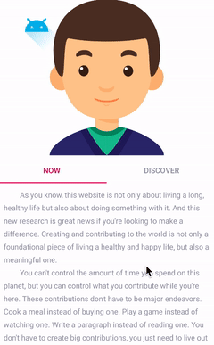
其实简单来说,MotionLayout 能够将自身的动画过程与 Lottie 同步,就像图中的安卓机器人动画就是 MotionLayout 实现的,而下面的卡通人物眼神游离的动画则是 Lottie 动画,从图中可以看到,通过手势滑动 ViewPager 两个动画一直保持着“同步运动”。下面我们来看看如何实现的,首先是布局文件,比较简单:
1
2
3
4
5
6
7
8
9
10
11
12
13
14
15
16
17
18
19
20
21
22
23
24
25
26
27
28
29
30
31
32
33
34
35
36
37
38
39
40
41
42
43
44
45
46
47
<?xml version="1.0" encoding="utf-8"?>
<androidx.constraintlayout.widget.ConstraintLayout
    xmlns:android="http://schemas.android.com/apk/res/android"
    android:id="@+id/motionView"
    android:layout_width="match_parent"
    android:layout_height="match_parent"
    android:background="@android:color/white"
    xmlns:app="http://schemas.android.com/apk/res-auto">
    <com.moos.constraint.widget.ViewpagerHeader
        android:id="@+id/header"
        android:layout_width="match_parent"
        android:layout_height="300dp"
        app:layoutDescription="@xml/motion_with_view_pager"
        app:layout_constraintTop_toTopOf="parent"
        app:layout_constraintStart_toStartOf="parent"
        app:layout_constraintEnd_toEndOf="parent"
        app:motionProgress="0">
        <com.airbnb.lottie.LottieAnimationView
            android:id="@+id/lottieView"
            android:layout_width="match_parent"
            android:layout_height="match_parent"
            app:lottie_rawRes="@raw/face"/>
        <ImageView
            android:id="@+id/ic_robot"
            android:layout_width="wrap_content"
            android:layout_height="wrap_content"
            android:src="@drawable/ic_launcher_foreground"/>
    </com.moos.constraint.widget.ViewpagerHeader>
    <com.google.android.material.tabs.TabLayout
        android:id="@+id/tabLayout"
        android:layout_width="match_parent"
        android:layout_height="wrap_content"
        app:tabSelectedTextColor="@color/colorAccent"
        app:tabTextColor="@color/content_text_color"
        app:layout_constraintTop_toBottomOf="@+id/header"
        app:layout_constraintStart_toStartOf="parent"
        app:layout_constraintEnd_toEndOf="parent">
    </com.google.android.material.tabs.TabLayout>

    <androidx.viewpager.widget.ViewPager
        android:id="@+id/viewPager"
        android:layout_width="match_parent"
        android:layout_height="0dp"
        app:layout_constraintTop_toBottomOf="@+id/tabLayout"
        app:layout_constraintBottom_toBottomOf="parent">
    </androidx.viewpager.widget.ViewPager>
</androidx.constraintlayout.widget.ConstraintLayout>
至于这个 ViewPagerHeader 相信大家也猜到了,其实也是个 MotionLayout :
1
2
3
4
5
6
7
8
9
10
11
12
13
14
15
16
class ViewpagerHeader @JvmOverloads constructor(
    context: Context, attrs: AttributeSet? = null, defStyleAttr: Int = 0
) : MotionLayout(context, attrs, defStyleAttr), androidx.viewpager.widget.ViewPager.OnPageChangeListener {

    override fun onPageScrollStateChanged(state: Int) {
    }

    override fun onPageScrolled(position: Int, positionOffset: Float, positionOffsetPixels: Int) {
        val animateProgress = (position.toFloat() + positionOffset)/3
        Log.e("LottieMotionActivity", "viewpager scroll progress is: $animateProgress")
        progress = animateProgress
    }

    override fun onPageSelected(position: Int) {
    }
}
只不过它内部实现了 ViewPager 的 onPageChangeListener,以监听页面的滑动状态,然后计算出此时 MotionLayout 的动画进度,这里由于 json 动画文件存在问题,所以只截取了一部分动画过程来执行。说了这么多,它的 MotionScene 是什么样的呢?其实很 easy:
1
2
3
4
5
6
7
8
9
10
11
12
13
14
15
16
17
18
19
20
21
22
23
24
25
26
27
28
29
30
31
32
33
34
35
36
37
38
39
40
41
42
43
44
45
46
47
<?xml version="1.0" encoding="utf-8"?>
<MotionScene xmlns:android="http://schemas.android.com/apk/res/android"
    xmlns:motion="http://schemas.android.com/apk/res-auto"
    xmlns:app="http://schemas.android.com/apk/res-auto">
    <Transition
        motion:constraintSetStart="@+id/start"
        motion:constraintSetEnd="@+id/end">
    </Transition>

    <ConstraintSet android:id="@+id/start">
        <Constraint
            android:id="@id/lottieView"
            android:layout_width="match_parent"
            android:layout_height="match_parent"
            motion:progress="0"/>
        <Constraint
            android:id="@id/ic_robot"
            android:layout_width="wrap_content"
            android:layout_height="wrap_content"
            android:layout_marginStart="20dp"
            motion:layout_constraintTop_toTopOf="parent"
            motion:layout_constraintStart_toStartOf="parent">
            <CustomAttribute
                app:attributeName="colorFilter"
                app:customColorValue="@android:color/holo_blue_light"/>
        </Constraint>
    </ConstraintSet>

    <ConstraintSet android:id="@+id/end">
        <Constraint
            android:id="@id/lottieView"
            android:layout_width="match_parent"
            android:layout_height="match_parent"
            motion:progress="1"/>
        <Constraint
            android:id="@id/ic_robot"
            android:layout_width="wrap_content"
            android:layout_height="wrap_content"
            android:layout_marginEnd="20dp"
            motion:layout_constraintTop_toTopOf="parent"
            motion:layout_constraintEnd_toEndOf="parent">
            <CustomAttribute
                app:attributeName="colorFilter"
                app:customColorValue="@color/colorAccent"/>
        </Constraint>
    </ConstraintSet>
</MotionScene>
唯一需要值得注意的是:这里我们分别在 MotionLayout 的起始位置和终止位置设置了 motion:progress 属性为 0 和 1,由于 LottieAnimationView 内部拥有 setProgress 方法,这样做的目的就是将 Lottie 的动画过程与 MotionLayout 进行绑定,我们只需要改变这个属性,就能够间接控制 Lottie 动画啦😁。
最后,我们只需要在 Activity 中设置如下代码就可以成功执行啦:
1
2
3
4
5
6
	val adapter = ViewPagerAdapter(supportFragmentManager)
	adapter.addPage("Now", R.layout.holder_layout)
	adapter.addPage("Discover", R.layout.holder_layout)
	viewPager.adapter = adapter
	tabLayout.setupWithViewPager(viewPager)
	viewPager.addOnPageChangeListener(header as 				androidx.viewpager.widget.ViewPager.OnPageChangeListener)
当然,MotionLayout 还能和很多组件进行联动,篇幅有限就不一一介绍啦,到这里,我们本篇文章内容也差不多该告一段落了,关于 MotionLayout 系列文章的所有示例代码都能够在 GitHub 仓库中找到:
https://github.com/Moosphan/MotionLayoutSamples
后续
如此一来,MotionLayout 系列已经完成两篇文章了,剩下的内容应该还需要一篇文章来容纳,后续可能还会额外提供一篇实战系列文章。下一篇文章主要介绍 KeyFrameSet 家族最后一个成员以及 MotionLayout 多状态场景的使用,同时,也会介绍如何实现与 RecyclerView “强强联合”。最后,Google 在 Android studio 4.2 终于推出了 Motion Editor 工具,下篇文章也会通过一个小实战项目来介绍其用法,拭目以待。
笔者说
最近这两篇文章都尽量做到每个重要知识点都提供一个实战的小示例,力求做到加深理解,文中很多内容都参考自 Nicolas Roard 对于 MotionLayout 的系列教程和 Android 官方文档,并加入自己的理解。从去年编撰第一篇文章时来看,国内对于 MotionLayout 的系列文章非常少,写文章的目的其实很简单,让自己消化新知识的同时,也能够让更多国人知道、认识和尝试使用 MotionLayout 这个全新的动画组件。
由于个人技术能力和表述能力有限,很多内容可能并没有讲解全面和透彻,如果有什么建议或者问题,欢迎留言区探讨,一起进步🍺。
许可协议: 署名-非商业性使用-禁止演绎 4.0 国际 转载请保留原文链接及作者。